Tasks
Using Processing:
Find a set of data in csv format and visualise it. Think carefully about what data you want to
visualise. An example of where you might look for your data set is the UK government web
site: https://www.gov.uk/government/statistical-data-sets . Alternatively you could export
your own data as a CSV from a running or sleep tracking app.
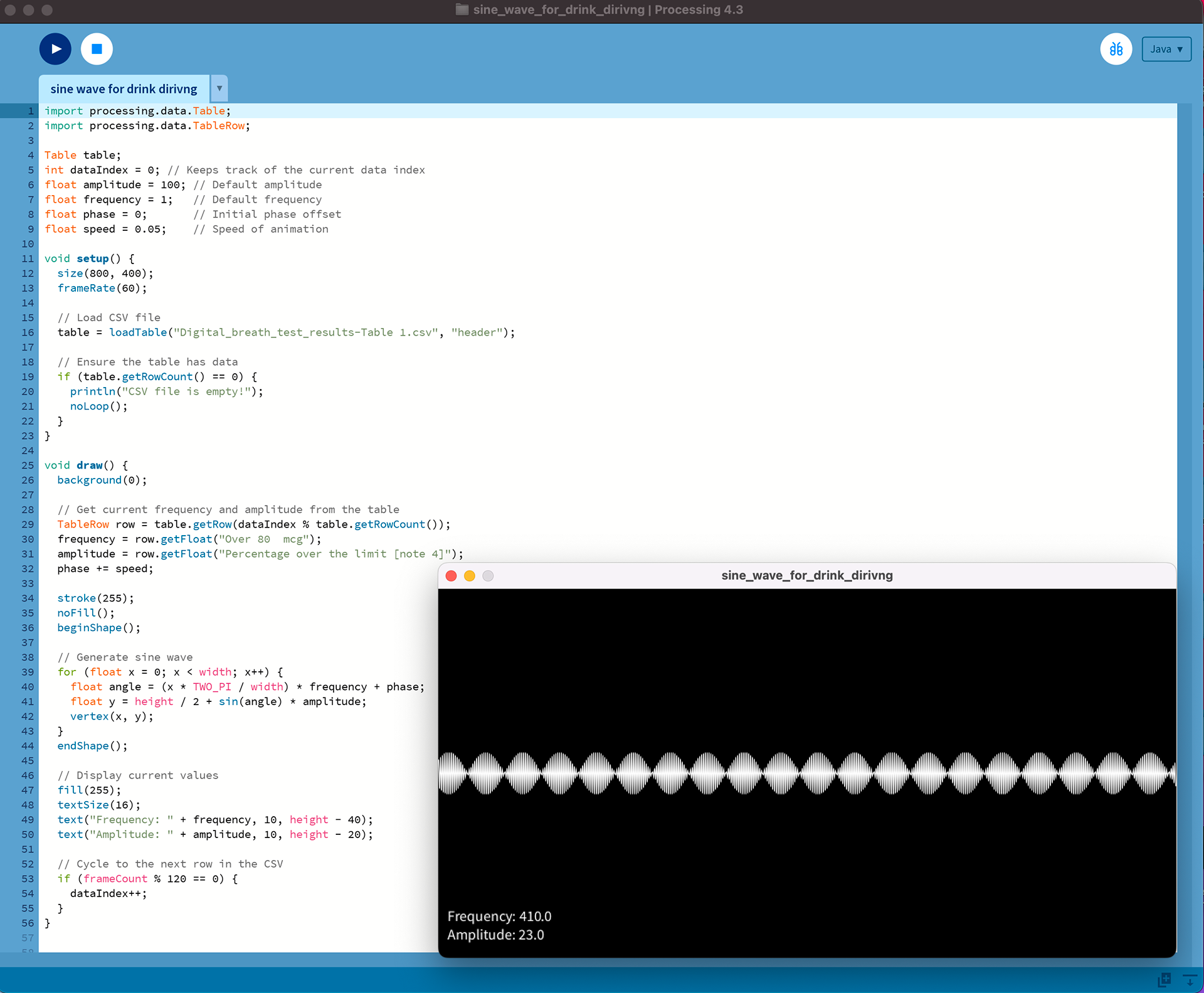
I downloaded data from the Office of National Statistics and compared various data sets in Processing.
This one presented drink driving figures as sine waves:

My personal favourite was this one, comparing the prices of bananas in different countries with their drink-driving casualties per year. It seems obvious that the banana consumption is directly proportional to its alcohol fatalities. Alas, there was less per-country data for the drink-driving data set than for the banana which, bizarrely, the ONS seems to document rigidly.


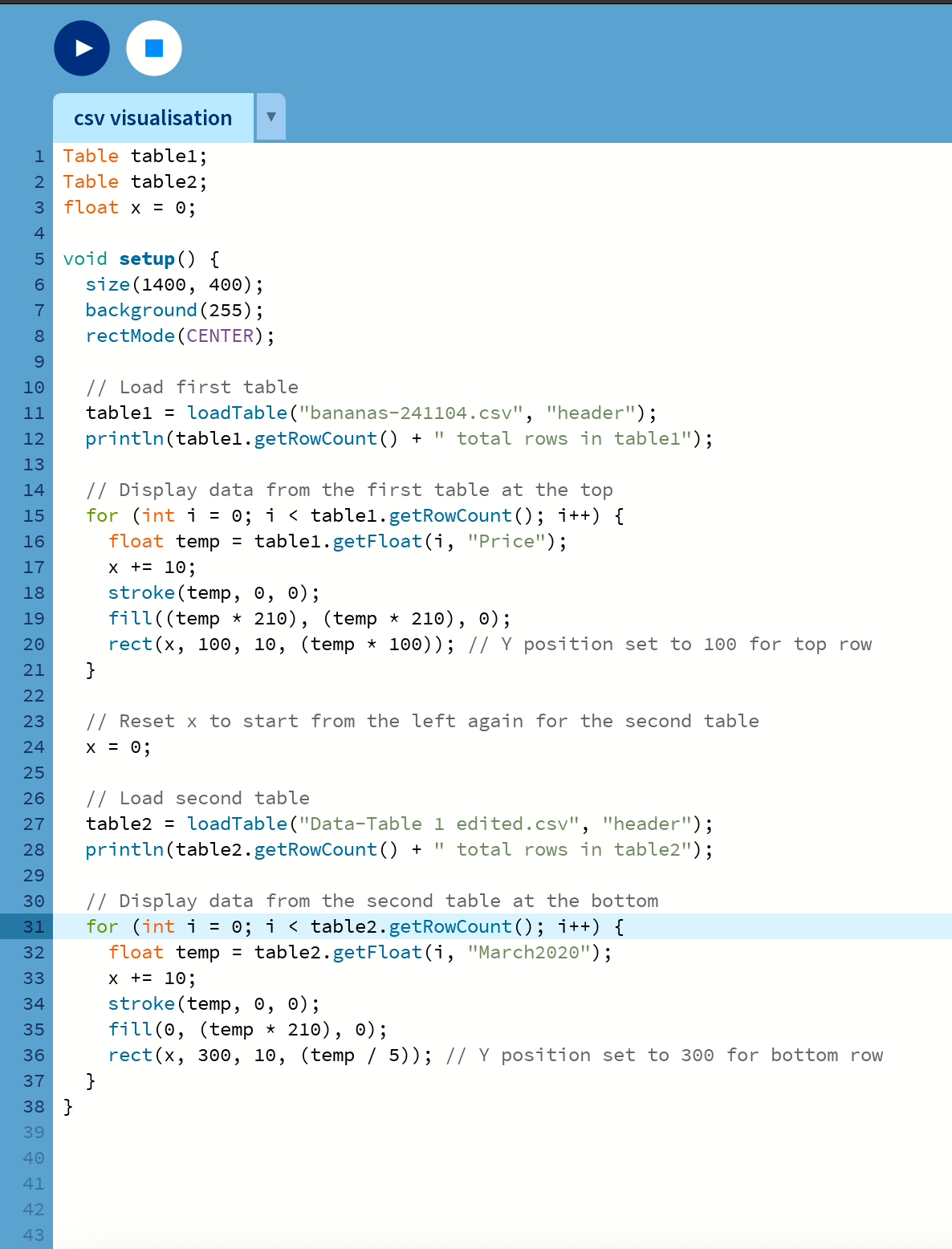
I did many, many more of these, but they all have the same basic code, which is:

You then change the csv file to the relevant one, pick the relevant rows and columns, and it gives you a handy little bar graph. Adding a second one underneath for comparison purposes works in basically the same way, resetting x to 0 to start again from the left, load in the new csv data file, pick the new rows/columns, and position it lower on the x axis.

